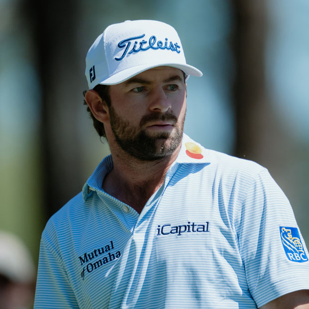
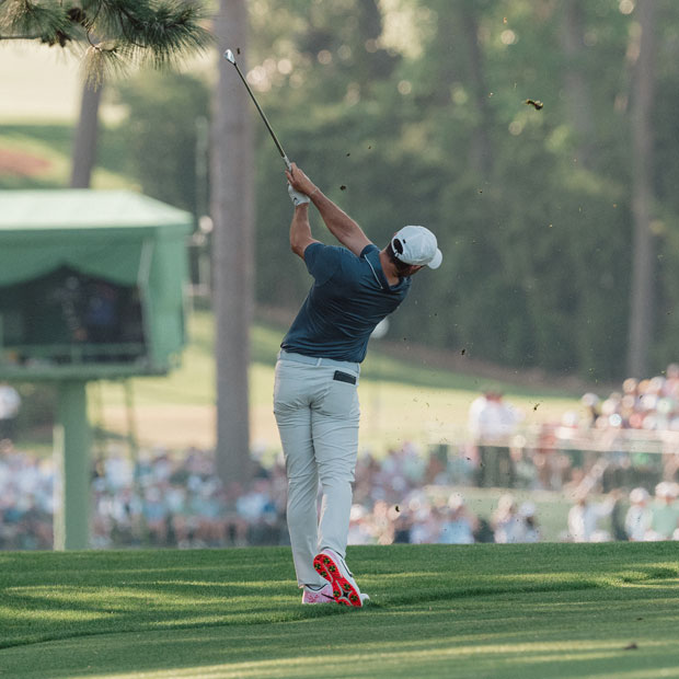
Roundtable: Reacting to Team USA's Ryder Cup Scripting for Bethpage
The Fried Egg group chat's reaction was too good to not share


On Monday, the scripting for the U.S. Ryder Cup team was unveiled, and the reviews were, how should we say, not great. The comments in the Fried Egg group chat were simply too good not to share with you all.
Will Knights: My general takeaway is that there are only so many different ways you can combine red, white, and blue, but I am certain that there are better ways than what they chose. Do we really need pixelated patches on chests that make you question your eyesight? Or blocky white and blue lines that look more like one of those mind-benders you’d find in a Highlights magazine?
Also, I thought we left zipper collars back in 2007? If we’re bringing the mid-2000s back, I would love to see someone put a Nike Sasquatch driver in play on the first tee and with “We Fly High” by Jim Jones playing in the grandstand. I’m all in on that.
{{inline-article}}
Abby Liebenthal: This is my Met Gala. I can’t wait to see these gents walk through a grandstand tunnel as their runway. I have three questions:
1. Will Bryson be able to get the polos without a zipper or buttons over his head?
2. Is the Monday shirt design inspired by 90s Styrofoam cups?

3. Will there be a life-size RL bear on property, and will it actually be PJ?
PJ Clark: The grey hats? Bad. Split paneling? Also bad. Does Sunday’s shirt look like something we’ll look back on fondly in 25 years? Sure doesn’t. Not a lot of it is good. One thing is especially jarring, though… the bomber jacket.
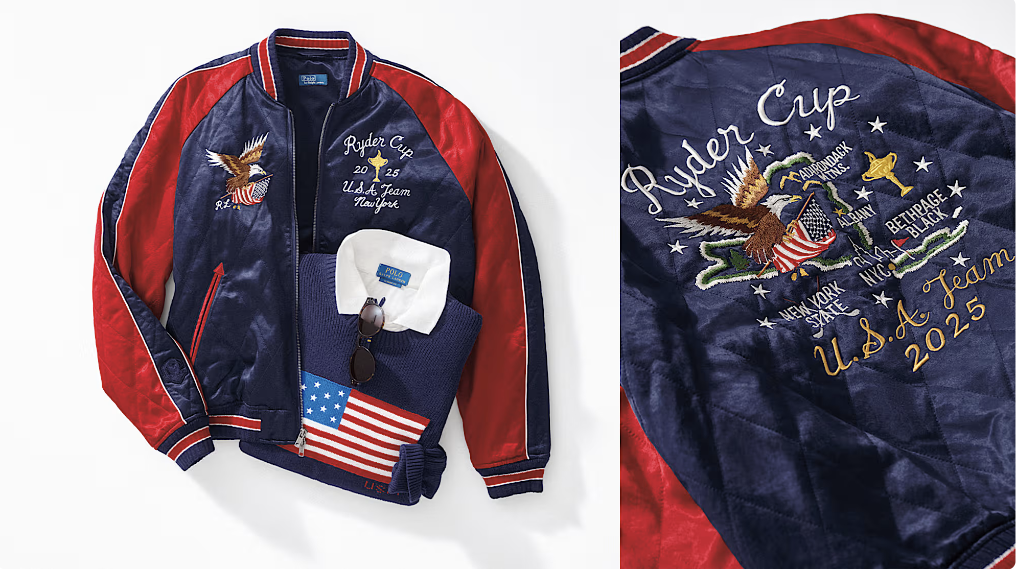
This bomber jacket is sure to be a family heirloom for Long Islanders for generations to come. The front features the Ryder Cup itself with some 2025 branding and an eagle carrying the stars and stripes as it flies across the right side of one’s chest. The back, however, is the real star. That same eagle continues its flight across a tangentially correct outline of the state of New York, which has landmarks such as Albany, the Adirondack Mountains, and, of course, Bethpage Black marked off. Are any of these landmarks in the right location? Kinda! Just imagine Kevin Kisner driving his cart down the 15th fairway while wearing one of these bad boys with some aviators on. It’ll be great.
Meg Adkins: I’ll echo my colleagues' sentiments on the Ralph Luh-ren (Keegan Bradley fancy boy pronunciation) uniforms. There's a little good, a lot of bad, and some serious ugly in there. I sure hope we see some uniform-related gambling odds in the coming weeks. Bryson wearing the bomber jacket is an absolute lock. My favorite thing by far about the uniform announcement was this nugget from David Lauren, Ralph Luh-ren's Chief Branding and Innovation Officer, when asked about captain and player input: "Their feedback has been crucial in developing our products, whether that be the precise cut of the pants or the exact drape of a polo. We once actually had Tom Watson get into the shower to test our latest rain gear. That’s the level of detail we go into."
If we don't get a behind-the-scenes look of a windshirt-clad Keegan in a shower, what are we doing here?
Brendan Porath: Don Rea has stepped to the microphone, asked to follow up just a little bit, and proclaimed that “Lisa Pavin” is not walking through that door. In recent years, the American Ryder Cup operation, in partnership with Ralph Lauren, has put some pretty firm guardrails up. Monotony carried the day. Basic reds, whites, and blues were only allowed, with frequent striping. Also, that offensive flattening USA font emblazoned on everything. For Bethpage, the colors remain, but we have some Pavin-style avant-garde elements that have been missing in recent years. They’re mostly terrible, and I love it.
The absolute refusal to F around with buttons on the polos for the first two days of competition is stimulating. How about we give you no buttons and you like it? What about the zipper placket for a full two-day Saturday session?
Those are just amusing. The more conventional button-boy polo for Sunday is actually bad. Loud in a bad, not fun way.

Anyways, I love that there’s some real provocation going on here again.
Do Ryder Cup uniforms matter? No. Are they a fruitful source of derision and amusement? Yes. It’s fun to have fun. When else are we going to get Patrick Cantlay or Russ Henley in a bomber jacket? Also, they’re going to sell so much of this stuff on Long Island.
What do you think of the scripting? Let us know in the comments below!


Leave a comment or start a discussion
Engage in our content with thousands of other Fried Egg Golf Club Members
Engage in our content with thousands of other Fried Egg Golf Members


Reviewing Rory McIlroy: The Masters Wait
.jpg)
2026 FEGC Summer Member-Guest Details
Q&A: Gene Wojciechowski on New Novel, 'All Carry'
Excerpt: All Carry, A Novel by Gene Wojciechowski

March FEGC Hangout: Travel, Essex County Club, and Merion Golf Club Talk with Jack and Amanda Davis

New FEGC Opportunity: Member Day at Brambles (April 30, 2026)
Get full access to exclusive benefits from Fried Egg Golf
- Member-only content
- Community discussions forums
- Member-only experiences and early access to events
Leave a comment or start a discussion
Lorem ipsum dolor sit amet, consectetur adipiscing elit. Suspendisse varius enim in eros elementum tristique. Duis cursus, mi quis viverra ornare, eros dolor interdum nulla, ut commodo diam libero vitae erat. Aenean faucibus nibh et justo cursus id rutrum lorem imperdiet. Nunc ut sem vitae risus tristique posuere. uis cursus, mi quis viverra ornare, eros dolor interdum nulla, ut commodo diam libero vitae erat. Aenean faucibus nibh et justo cursus id rutrum lorem imperdiet. Nunc ut sem vitae risus tristique posuere.